COVID-19 has completely reshaped how we live and interact within our homes. Areas once taken for granted have been transformed into relaxing nooks or creative spaces, as our home activities diversify and we look for spaces to be comforted, safe and inspired. Whilst within other areas, functionality meets form as we cleverly adapt spaces to meet the demands of working from home, home schooling or simply juggling the many aspects daily life brings.
As we continue to adapt to a new normal, our homes are a space where we can have control over what we put in, the experience we curate and how it makes us feel. This change in our way of living, provides the opportunity to enhance our environments to support our needs now, and well into the future. Be it adapting your home to enhance tranquillity, refreshing your style, adding functionality to entice would be buyers, or building greater connection to the outdoors, here are the top trends when transforming your home.
1. Create your sanctuary
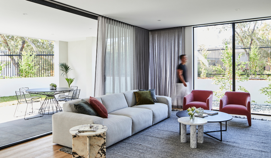
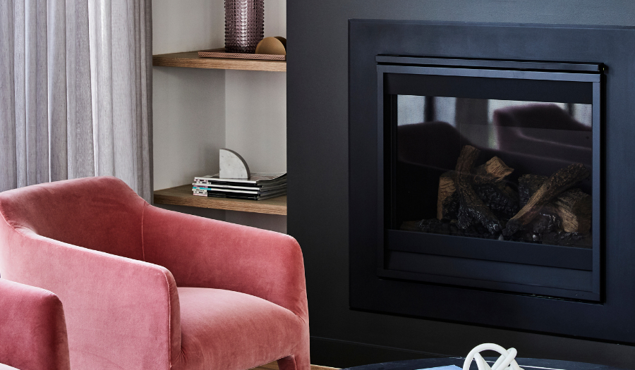
More than anything else, creating areas in your home that provide a sense of escape in tranquil surrounds and nurture the soul are a must. Be that a corner of a room with a favourite occasional chair and books at arms reach, placing oversized cushions near a window that captures the afternoon sun or more secluded spaces that transport you into your own zone. Redefining spaces and adding little luxuries to give areas a distinct zone whilst still having a seamless connection to your home not only demonstrates the flexibility of space but highlights to buyers the way in which they can personalise the most cherished ares within your home.

2. Work, study, play.
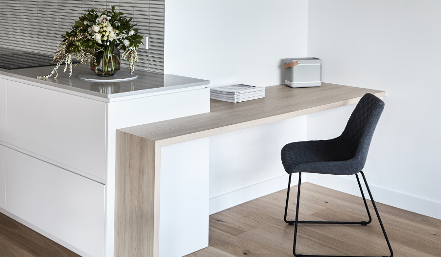
Gone are the days of simply placing a computer on the kitchen bench and attempting to focus on work whilst family life whirls around you. In the future, homebuyers will be more interested in defined office spaces in contrast to temporary desk set ups, and for homeowners clear and specific work zones will support you in the here and now. Research shows that delineating work zones from relaxation spaces or social areas helps you transition from work to play and supports positive mental health and enhanced productivity. With the wealth of modular home layouts and functional interior design, creating a separate study and work zone can be simple. Be it converting a make-up shelf in your bedroom, building a study nook, or redesigning the layout of a larger room, there are endless ways to create your bespoke work zone and significantly improve your at-home lifestyle.

3. More flexible, multifunctional living spaces
As we all spend more time at how, how we transition from space to space is one of the most critical aspects to creating balance. Whilst there is value in creating dedicated workspaces that can be closed off as needed, ensuring the flexibility and adaptability of other areas will give your home the greatest buyer appeal. Spending more time at home means a heightened need for these spaces to be flexible and multi-functional. Taking a leaf out of leading European and Japanese design trends, separating some fixtures, allows multiple people to access the same area whilst simultaneously providing privacy. Simple and trendy interior design hacks such as dividers and strategically located panels can act as a perfect way to maintain an open living style, whilst also providing flexibility for the diversity of daily activities. Alternatively, designing your open area into sub areas through placement of furniture and lighting will help maximise your space, creating dedicated zones that also work together harmoniously.
4. Connection to the outdoors
While outdoor living zones have always been popular, life in lockdown has put a greater emphasis on the importance of having a real connection with nature. With us all needing to focus inwards for a time, seeking opportunity to bring the outside in and the inside out within the privacy and safety of our four walls has never been more prominent. Inside the home, there has been a burst of demand for access to natural light, air filtration, and free flowing cross ventilation. More and more leading designers are prioritising built in courtyards, feature plants and floor to ceiling windows to promote a connection to nature. Moreover, skylights and ceiling voids are becoming key design features providing people the needed comfort in their homes through light, air and access to the outside. Thoughtful design considerations such as these can add a carefully curated layer to your home, providing a duality of experience, whereby your family can experience the outside whilst being inside.

5. Energy efficient homes
As we spend more and more time at home, our energy bills will increase, and we will have greater appreciation for the ways in which we can conserve our energy. Moving towards thoughtful design and leading building technology can further help us in this journey and assist in reducing our global footprint. When renovating or building a new home, choosing the right building materials from the start is an important consideration. Hebel is the perfect choice, offering greater energy efficiency for a more financially efficient household. Strong, high performance, versatile and environmentally friendly, Hebel’s insulation properties are designed to keep your home cool in summer, and warm in winter. Combined with its ability to reduce noise from the outside Hebel creates a beautiful way to live, balancing your design needs with sustainability and energy efficiency requirements along with year-round comfort, that enhances your tranquil space.
Imagery – Thomas Archer


